Thursday, September 28, 2006

Campus Ministry Mission Stmnt.

The objective on my Campus Ministry website will be to provide clear and concise information about the Ministry and its events such as retreats, sermons, and student and family events. It will be easy to navigate and easy to navigate to through the Quinnipiac University web site. It will demonstrate its school allegience as well as its acceptance to all people of the Quinnipiac community.

Pages 34-79

1. The book talks of grouping certain things together because they "want" to be together. This is based on how things fall under categories. When someone is searching for a particular subject, they must follow different categories in which that subject pertains to. When designing, we must make sure our information is put into the right categories for our audience.
2. The ideas of giving a site personality were interesting, in their ability to create emotion in the audience; such as "get excited about football". However, I feel it is more pertaining to advertisements or product pages, not personal web sites.
3. Describing yourself is truly important. Telling the audience why you are unique is very crucial to the audience.
4. I really like sample combinations. I think this is part of my style or feel when designing in fact. I like to take parts of logos or images I've used and use them in other places and combined with other things I have created.
5.Mock up your navigations. Try different things before going with one too fast. You may find some things work better or happen to be better recevied by your audience.
Wednesday, September 27, 2006

Mission Statemtent (revised)

The purpose of my website is to exhibit many facets of my life and their closeness to my heart as well as showcase my writing, artwork, music, and future goals. It will be aimed toward a youthful audience whome I expect to be interested in underground and independent music as well as traditional and graphic art. This will serve as a powerful tool in creating connections with future career opportunities.

Thursday, September 21, 2006

Mission Statement

The purpose of my personal website is to allow people to see who I am and what I do. It will explore my thoughts through my writings, my interests, such as writing music, and my goals including my plans to work outdoors. It will explore many facets of my life and showcase my writing, artwork, music, and future goals. It will be aimed toward a youthful audience whome I expect to be interested in underground and independent music as well as traditional and graphic art.

Chapter 1

1. When creating a website, you must know what you want to say before you jump into it. The message must be clear to your audience. Also know that more goes into communicating than what your write on your site. The imagery and environment must appeal to many audiences.

2. Before designing it is important to know your client. You should develop a clear understanding of what you want to convey and design after a good model is made.

3. Knowing your audience is important in order to give them the ability to quickly and efficiently access what they need.

4. Functionality is the key ingredient. Easy to use websites are a must when trying to appeal to everyone.

5. A mission statement is a good way of clearly getting across your idea and testing all of your information as you design.

Thursday, September 14, 2006

Response

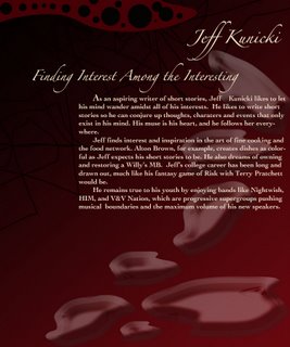
Jeff Kunicki's web site rendition of my personal "ultimate-design", was good. The font seemed a little immature for my taste, and possibly for much of my projected audience. However, the color design background is very intricate and well made. I especially liked the pixelated "color wheel" for the background because it says a lot about Jeff's personality. It covers a spectrum of color and is well rounded, much like Jeff in his worldliness and broad spectrum of interestes. The layout is good for a web site "foyer" or front page, but is lacking, in functionality, as a true homepage.

Preface

1) Presentation is a key factor, commonly overlooked, when creating a web page.

2)Visually presenting information is a common way of communicating an idea, however problems may arise with function if users are not familiar with the presentation.

3)The visual presentation should invoke emotion to hook a viewer as well as remaining organized.

4)Testing designs with audiences will help with their reactions when you go to publish. People are naturally biased in their opinions of style and funtion, therefore finding out what works best with your audience will increase your views.

5)There are no limitations on your design, just opportunities to create unique ways of communicating with your audience.

Sunday, September 10, 2006

Web Site Mock-Up for Jeff Kunicki

Thursday, September 07, 2006

Introduction

The history of the Web, as portrayed in "Site - Seeing", has gone through stages since it's inception, to become the highly-usable visual wonderland it is today. The web was first introduced by Tim Burners-Lee who wanted an easy way to transfer information from person to person. Once the format was introduced People were excited about the new technology and started creating tables and frames in order to share images and artwork as well as words. However the technology was new and had much to improve on, but first the designers came forth with an era of sites packed with lots of pictures and artwork that slowed down the usability. I remember this era being very prominant when I was first becoming introduced with the inthernet. As in the book, this era can be related to cars. At first, the hype was all about the technology, but like this era with the web, cars saw then bigger motors, radios, air conditioning, chrome, glitter paint, curves and lines and so on. These were expensive add-on's that were almost specifically for flash.The technology hype came when the notion that artwork and images have their place in the web and were somewhat, old news. With the new technology that came about animations were common as well as interactivity within the sites and their design. This however clouded the web with too much "fluff" and slowed the use and confused the users. Therefore the usability era came about. This era sought faster download times, more user friendly interfaces, and possibly, the truth (but that's a different story). These demands resulted in less glamour, in some cases, but allowed for a broader audience and a larger population of interest. The future of the web relies on us, to create the perfect environment for communication with whole world.

Tuesday, September 05, 2006

This is a Test

That's Right...a Test. Keep movin....take a picture...it'll last longer...be on your way.....oh..and enjoy.